
Week 4 Update: Exploring Visual Design and Getting Started with Figma in UI/UX


This week's Table of Contents:
1) Fundamentals of visual design: typography, color theory, layout
2) Hands-on practice with Figma for UI design
3) Creating design mockups for web interfaces
FUNDAMENTALS OF VISUAL DESIGN: TYPOGRAPHY, COLOR THEORY, LAYOUT:
A balance between aesthetics and functionality is crucial in web design to deliver a seamless user experience. To achieve this, designers must understand typography, color theory, and layout. Let's explore these elements and their interplay in creating captivating web interfaces and communicating the product's purpose and brand identity.
Typography:
Typography refers to using text in design and is essential in design. It determines how text is perceived. It involves hierarchy, readability, and tone. Each typeface carries its personality and conveys a message. By selecting fonts and using techniques like kerning, leading, and tracking, designers can improve readability and create emotional responses from users. When designing typography, consider choosing appropriate fonts that are readable and match the brand identity. Set consistent font sizes and styles throughout the product and use hierarchy to highlight key information.
Color:
Color is a powerful tool for creating an emotional response and conveying information. By striking the right balance between vibrancy, contrast, and harmony, designers can craft visually captivating interfaces that resonate with the target audience. To design effective color schemes, choose a color palette that matches the product’s brand identity and tone. Use color strategically to highlight important information, create contrast, or convey meaning. Ensure accessibility for all users, including those with visual impairments.
Layout:
Layout encompasses the arrangement of elements within a design, dictating the flow of information and guiding the user's journey. Layout and grid systems organize content and guide the user's journey. Designers balance spacing, alignment, and hierarchy for intuitive navigation. Responsive design principles enhance flexibility across devices.
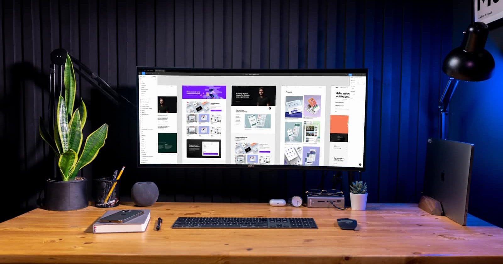
Hands-on practice with Figma for UI design:
Figma emerges as a versatile tool that empowers designers to bring their visions to life with precision and efficiency. Its collaborative features facilitate seamless communication and iteration, fostering teamwork and streamlining the design process. From wireframing to prototyping, Figma offers a comprehensive suite of tools tailored to the needs of UI/UX designers. Through hands-on practice and exploration, designers can harness Figma's capabilities to prototype interfaces, iterate on designs, and collaborate seamlessly with stakeholders.
Creating Design Mockups for Web Interfaces:
Design mockups serve as visual blueprints that communicate design concepts and functionality to stakeholders. By translating wireframes and prototypes into high-fidelity mockups, designers provide clients and developers with a tangible representation of the final product. Incorporating realistic imagery, typography, and interactive elements, design mockups enable stakeholders to envision the end product and provide valuable feedback early in the design process. Furthermore, mockups serve as a reference point for developers, ensuring consistency and accuracy during the implementation phase.
In conclusion, mastering visual design fundamentals in lays the groundwork for creating compelling web interfaces that captivate users and deliver seamless experiences. By delving into typography, color theory, and layout principles, designers can craft interfaces that not only look visually stunning but also resonate with users on a deeper level. Coupled with hands-on practice using tools like Figma and creating design mockups, designers can refine their skills and bring their creative visions to fruition in the dynamic world of web design